STUNT DOUBLE

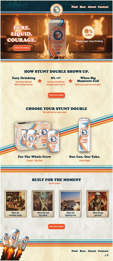
Pure. Liquid. Courage.
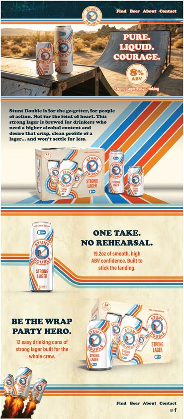
Stunt Double Beer is a full scale brand built from the ground up, rooted in 1970s stunt culture and designed to stand out in one of the most visually crowded categories. From the name to the mascot to the packaging and website, this project was about creating a complete brand world that feels confident, fun, and intentional without slipping into parody.
Role
Creative Director
Package Designer
Web Layout Designer.
Scope
Brand Strategy
Visual Identity
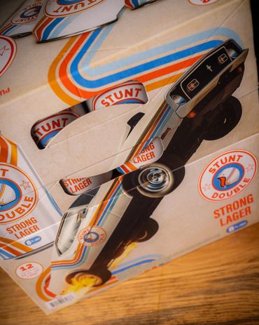
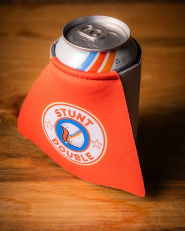
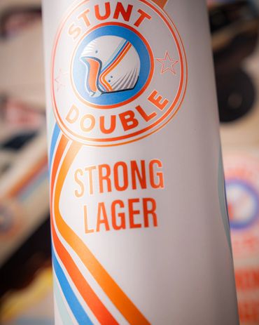
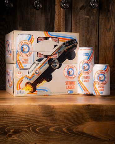
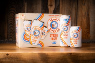
Packaging System
Illustration and Mascot Design
Website Design
Brand Imagery and World Building
The Challenge
The Challenge
The Challenge

The beer aisle is loud, crowded, and full of brands chasing the same visual tropes. The challenge was to create a lifestyle brand that could cut through instantly while still feeling disciplined and scalable across packaging, digital, and merchandise. Stunt Double needed to feel bold and humorous without becoming ironic or disposable, and distinctive enough to be recognizable at a glance.
The Idea
The Challenge
The Challenge
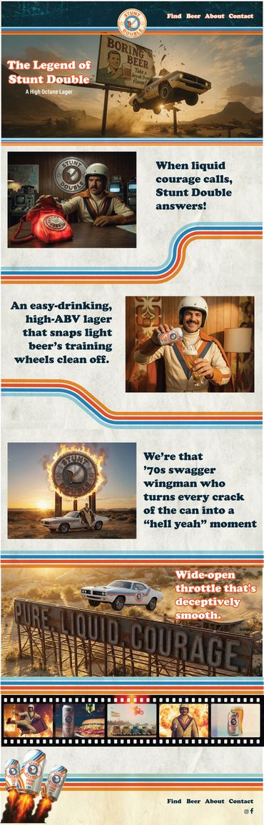
Behind every great stunt, there is a Stunt Double doing the real work.
That idea became the foundation of the brand. Stunt Double celebrates the unsung hero, the one who takes the hits, makes the impossible look easy, and never asks for the spotlight. It is a brand built on confidence, courage, and not taking itself too seriously unless the moment calls for it.
This narrative informed every creative decision, from the name and tone of voice to the visual system and character design.
Visual Identity and World Building
Visual Identity and World Building
Visual Identity and World Building
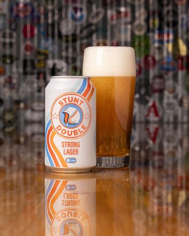
The identity system was designed to feel like a discovered artifact from a lost era of stunt crews and movie posters. Bold shapes, confident typography, and a tightly controlled color palette create a look that feels nostalgic without feeling dated.
The visual language balances playfulness with structure. Strong graphic elements and clear rules ensure the brand holds together across cans, merch, and digital applications, while illustration and character work add personality and humor.
Mascot
Visual Identity and World Building
Visual Identity and World Building
The Stunt Double character acts as both a mascot and a storytelling device. Inspired by vintage daredevil imagery, the character brings the brand to life across packaging, merchandise, and marketing moments. Every illustration reinforces the same tone, fearless, self aware, and built for fun.